Cinema Scope Magazine
project_type
Branding
project_timeline
3 months
programs_used
InDesign, Photoshop, and Illustrator
personal_roles
Layout Design, Brand Design, Typography
project_content
Context
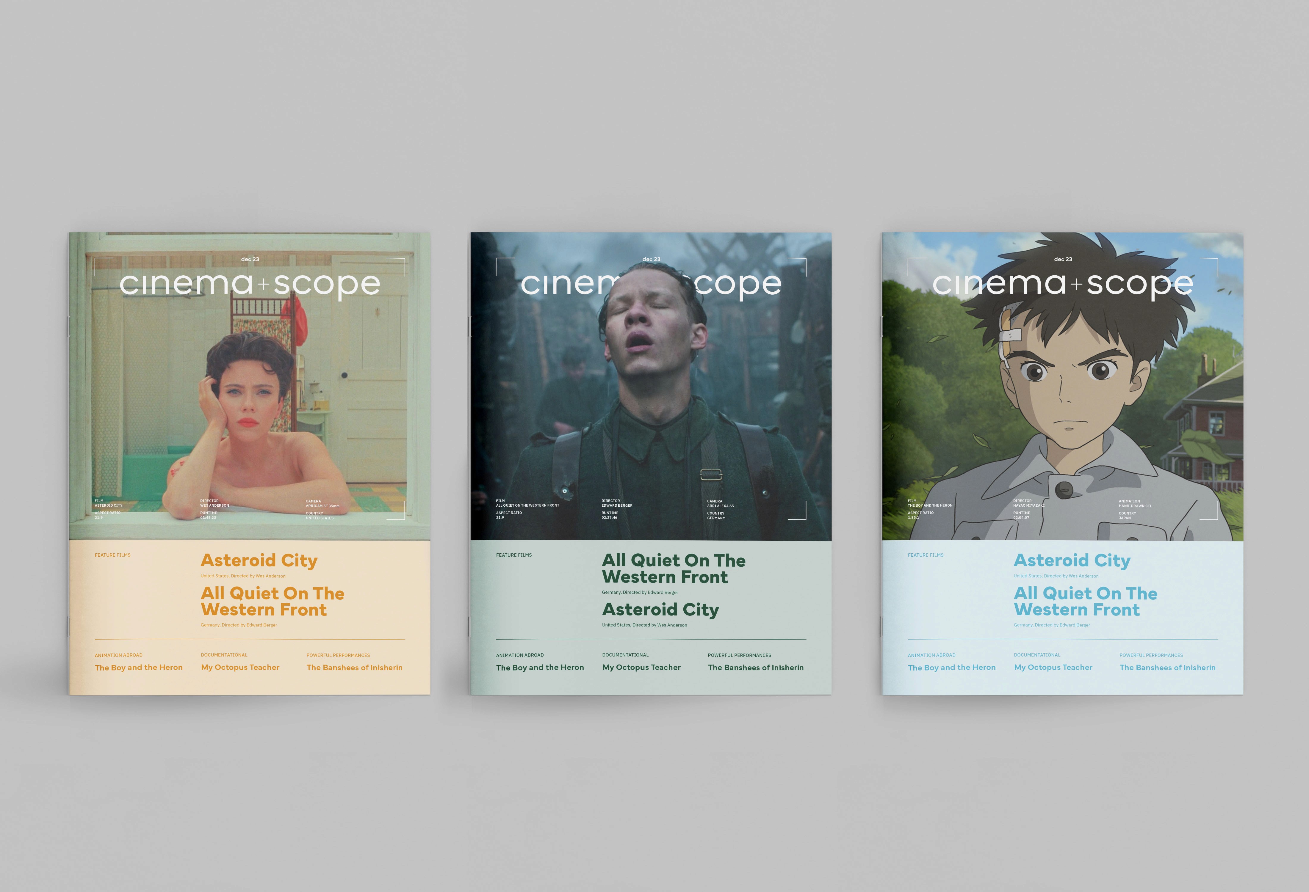
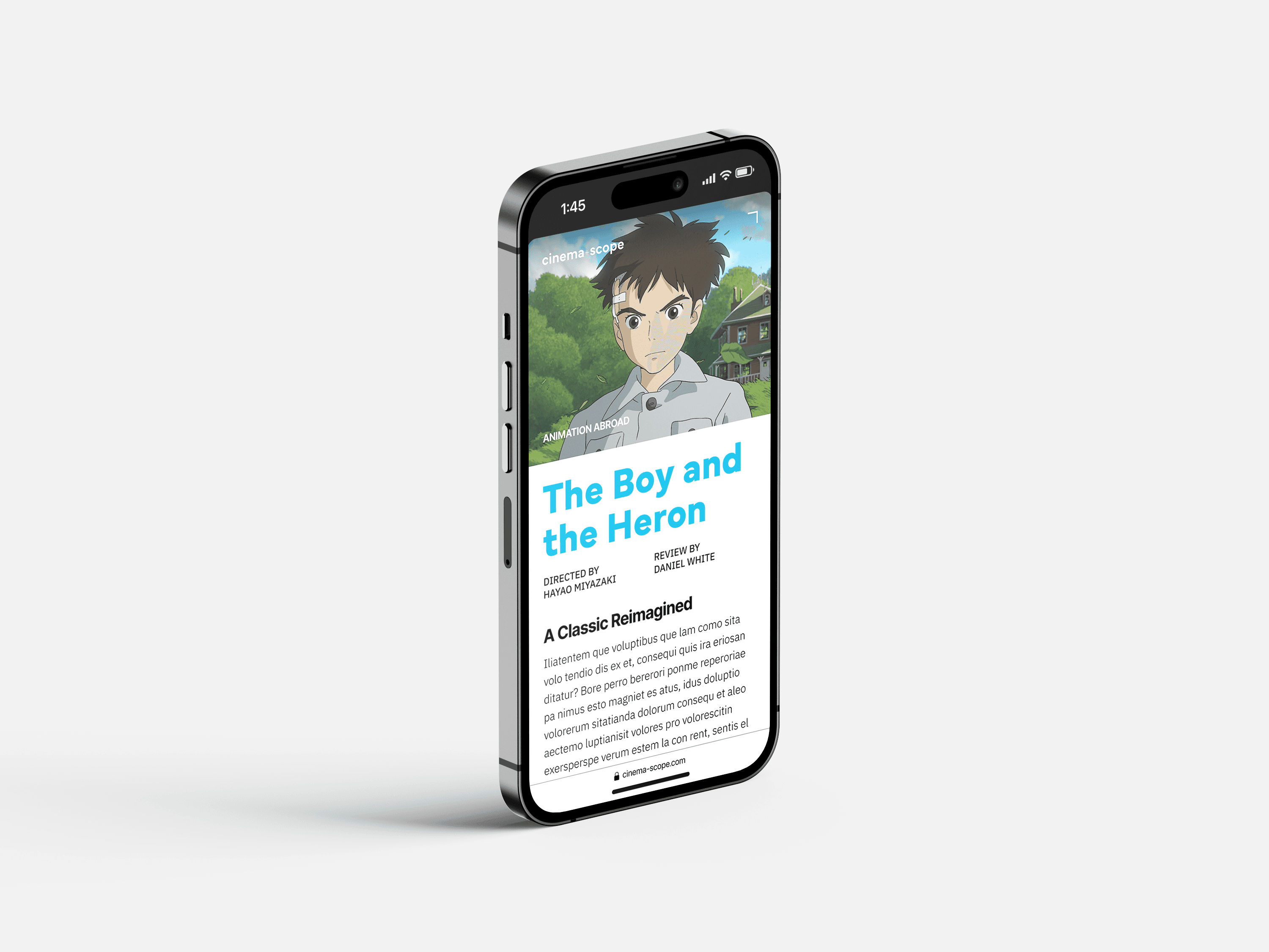
Cinema Scope is a magazine focused on international cinema. Based in Toronto, this magazine has operated for about 20 years focusing on new releases and curated discussions about the best in film. A major emphasis of their coverage is placed on annual film festivals like the Toronto International Film Festival. While they have a unique coverage and audience, their magazine leaves something to be desired. With more intentional design, their magazine could provide a more crafted read.
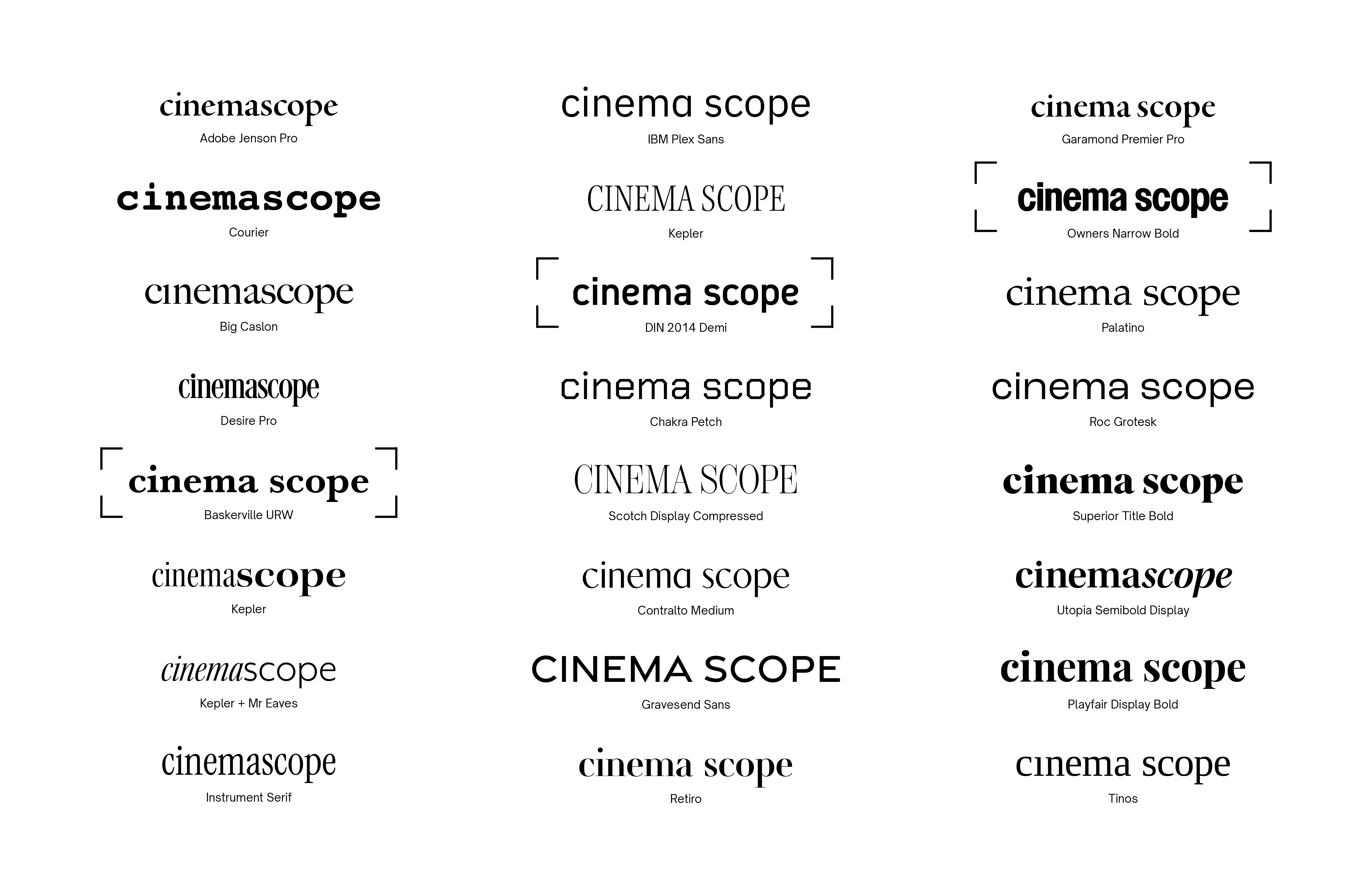
Masthead explorations at the start of the process.
Creating the Grid
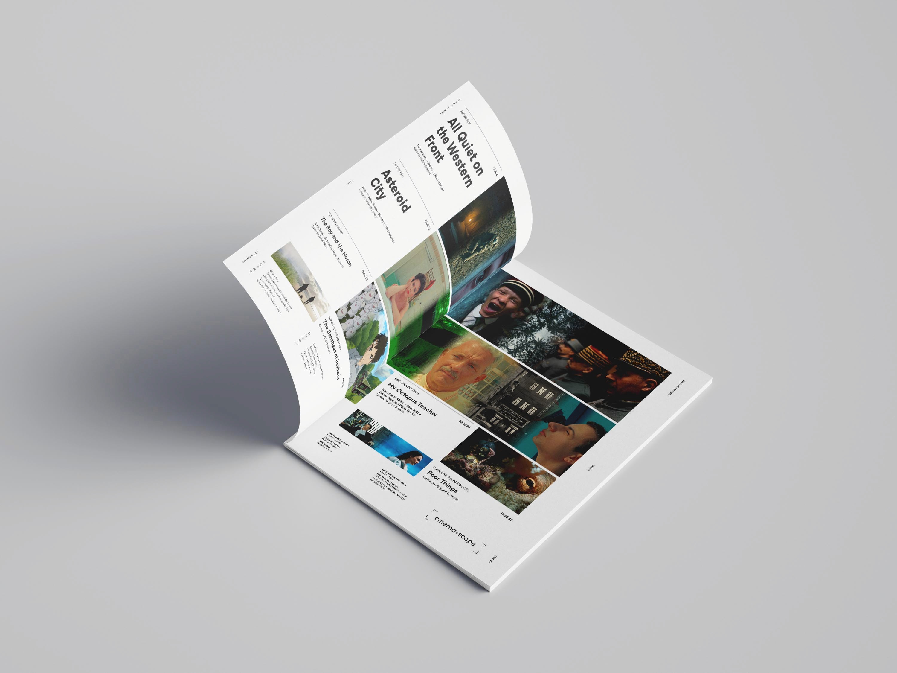
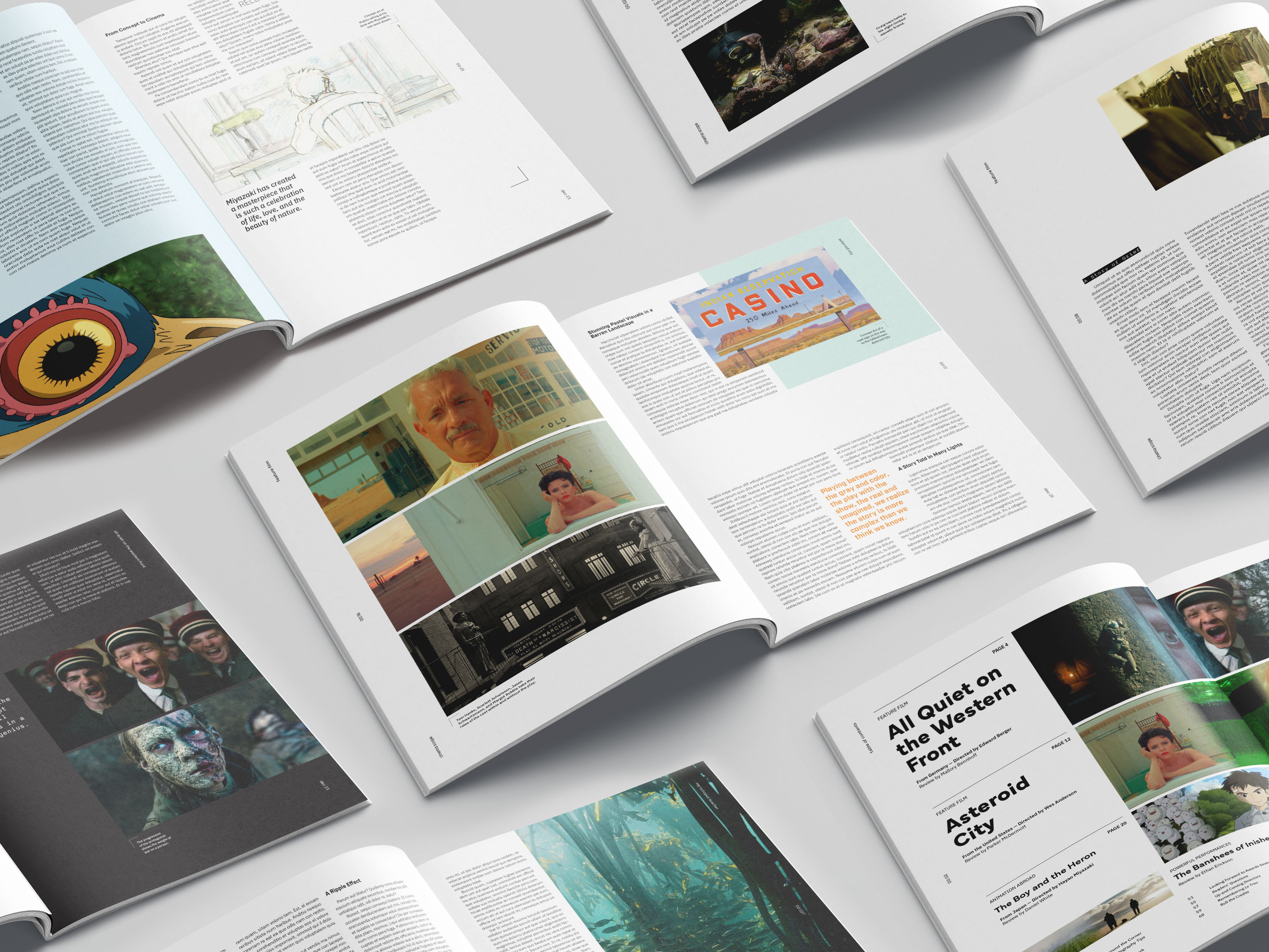
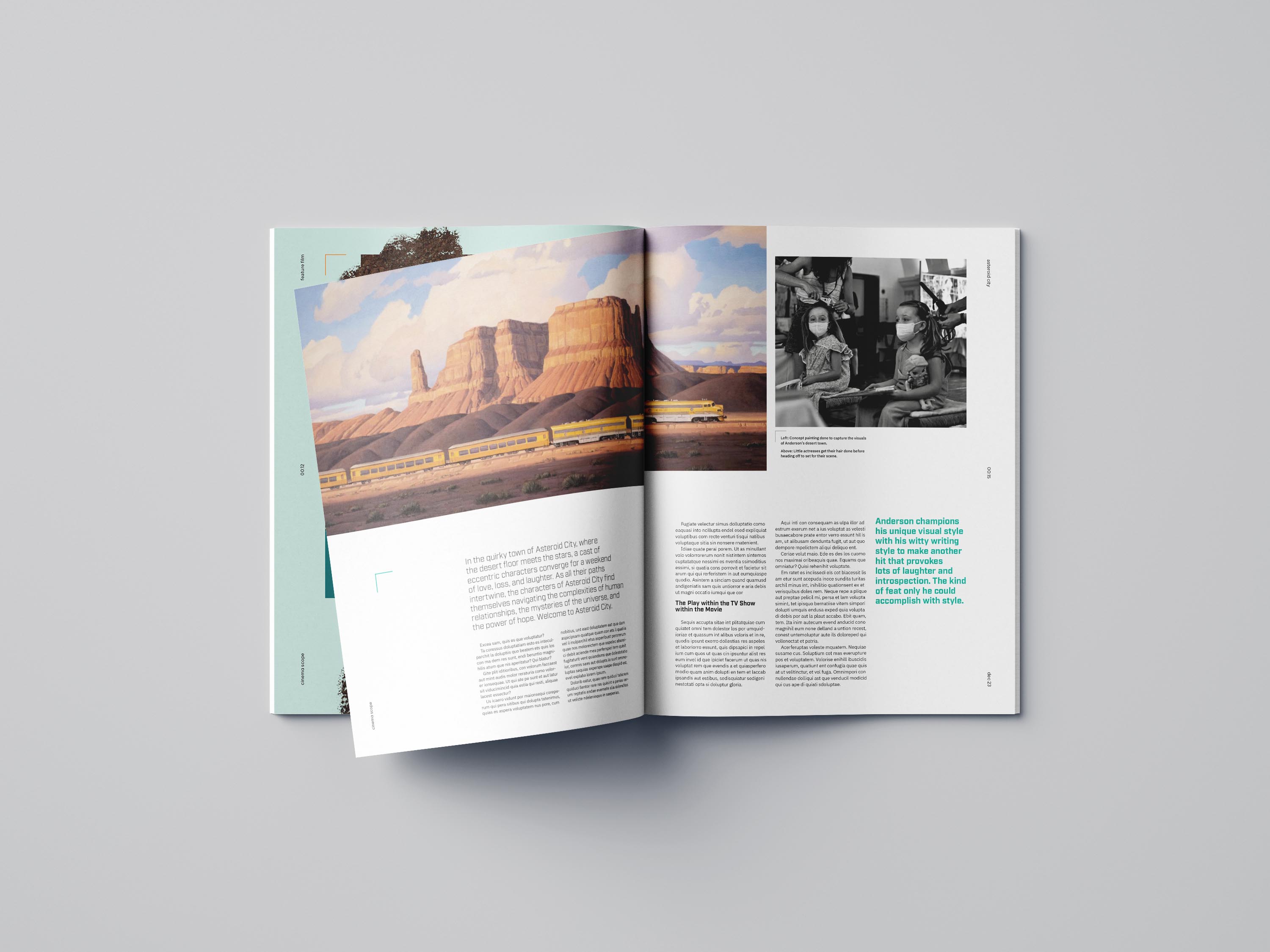
One of the most vital parts of the typography of a magazine is its grid. I went through several iterations to try to nail down just the right version. Since my magazine is meant to highlight the craft of film, I wanted the grid to be based on a traditional film aspect ratio of 21:9. This actually proved to be more difficult than I thought.

Typographic Systems
After establishing the grid, it took some more time to know what kind of typography I'd be using throughout the magazine including body copy font size, leading, paragraph spacing, headers, subheaders, running footers, and page numbers.
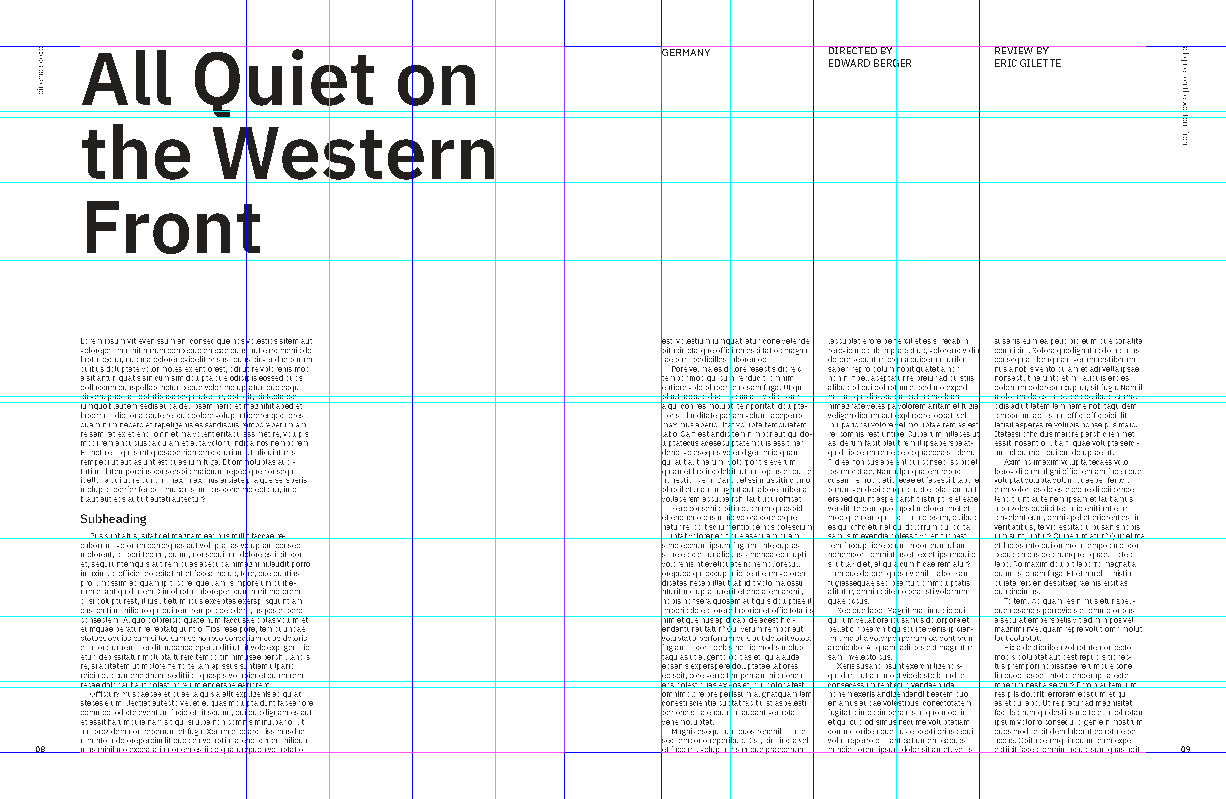
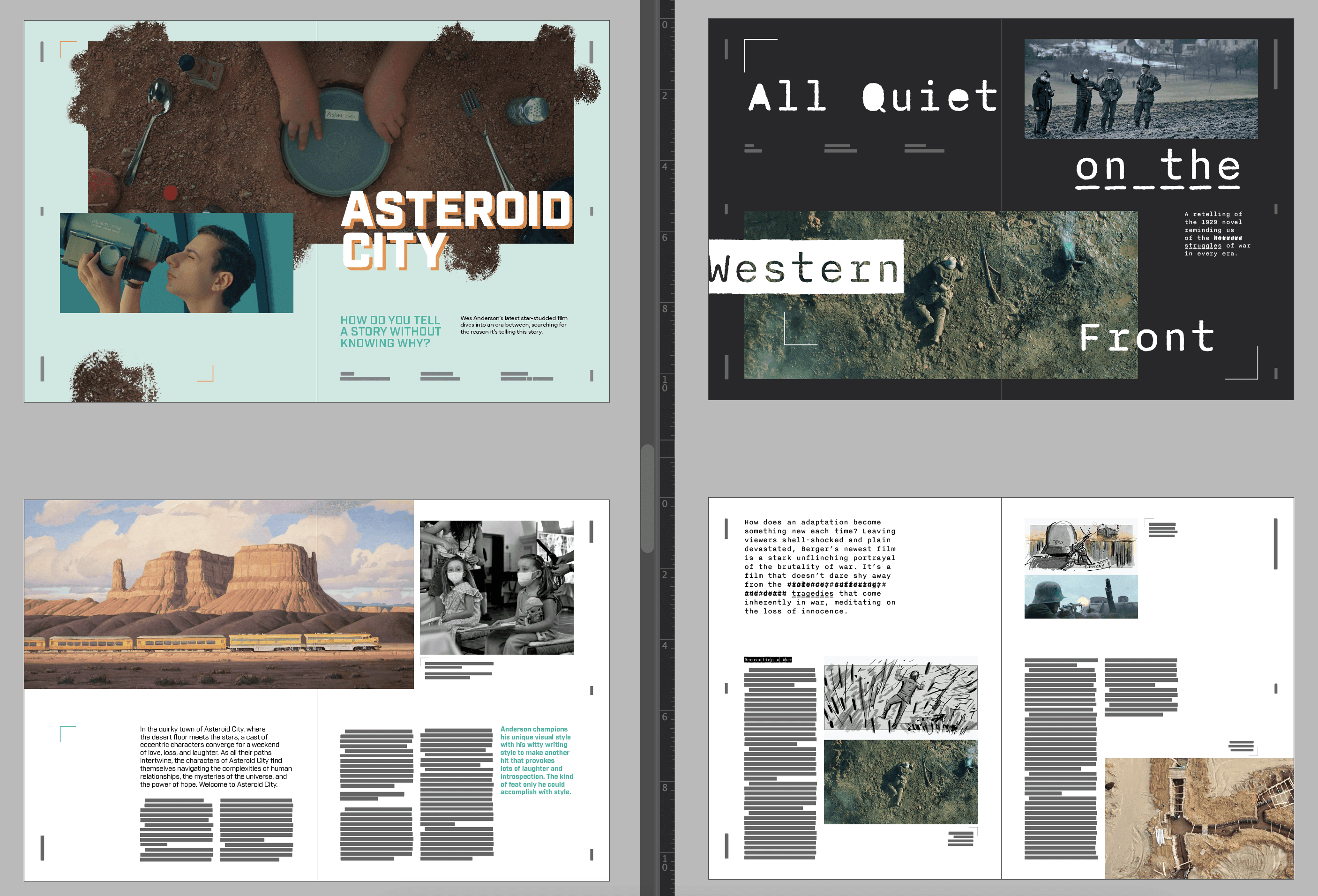
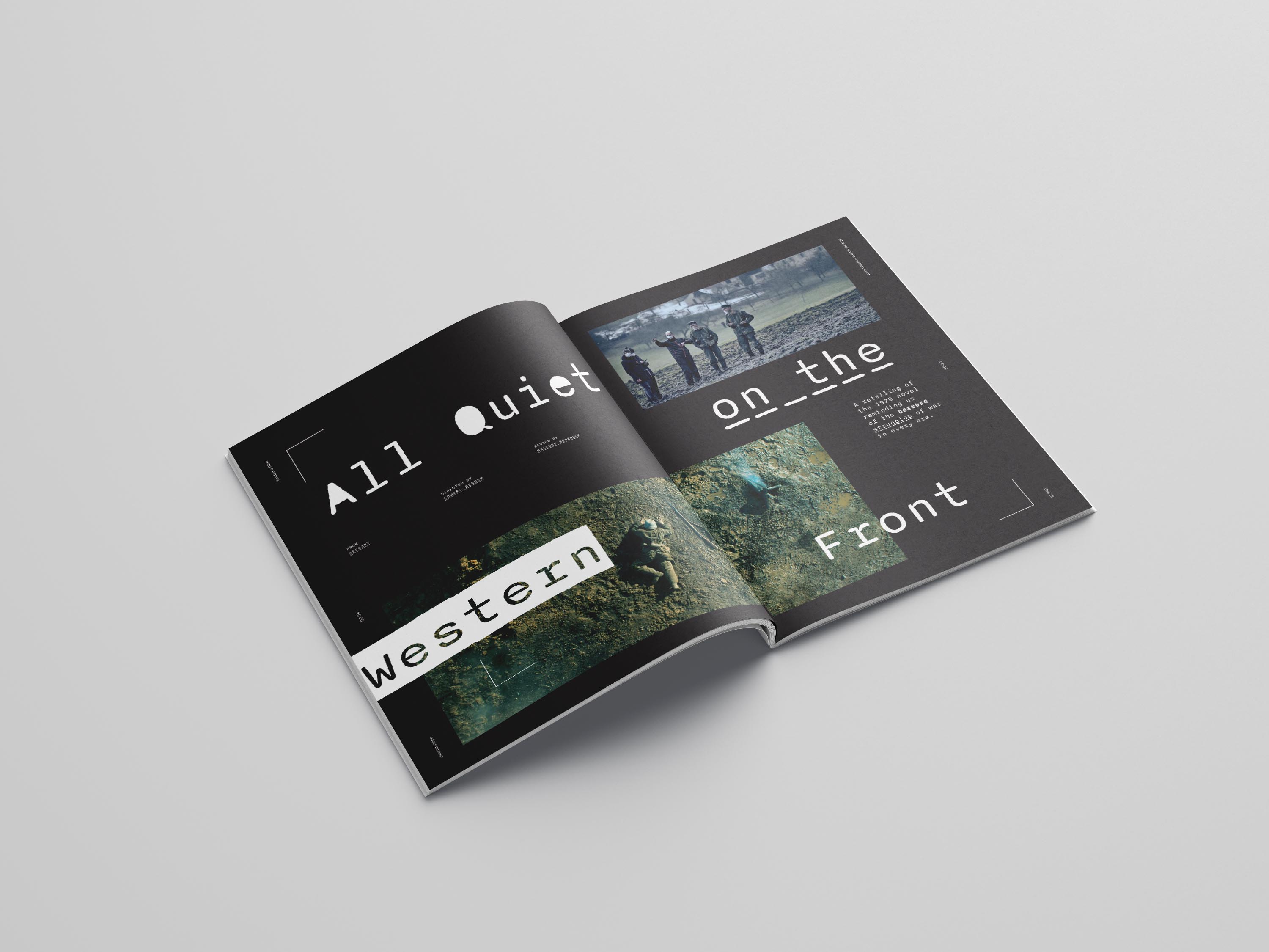
From that point, I started to explore different ideas and versions of the featured articles while maintaining the brand of my magazine. The features called for unique typography and layouts to make them feel like they stand out from the rest of the magazine. All of this while implementing the grid that I had previously established. It served as both a guide and something I could play with.


Context
Cinema Scope is a magazine focused on international cinema. Based in Toronto, this magazine has operated for about 20 years focusing on new releases and curated discussions about the best in film. A major emphasis of their coverage is placed on annual film festivals like the Toronto International Film Festival. While they have a unique coverage and audience, their magazine leaves something to be desired. With more intentional design, their magazine could provide a more crafted read.

Masthead explorations at the start of the process.
Creating the Grid
One of the most vital parts of the typography of a magazine is its grid. I went through several iterations to try to nail down just the right version. Since my magazine is meant to highlight the craft of film, I wanted the grid to be based on a traditional film aspect ratio of 21:9. This actually proved to be more difficult than I thought.

Typographic Systems
After establishing the grid, it took some more time to know what kind of typography I'd be using throughout the magazine including body copy font size, leading, paragraph spacing, headers, subheaders, running footers, and page numbers.

From that point, I started to explore different ideas and versions of the featured articles while maintaining the brand of my magazine. The features called for unique typography and layouts to make them feel like they stand out from the rest of the magazine. All of this while implementing the grid that I had previously established. It served as both a guide and something I could play with.


Context
Cinema Scope is a magazine focused on international cinema. Based in Toronto, this magazine has operated for about 20 years focusing on new releases and curated discussions about the best in film. A major emphasis of their coverage is placed on annual film festivals like the Toronto International Film Festival. While they have a unique coverage and audience, their magazine leaves something to be desired. With more intentional design, their magazine could provide a more crafted read.

Masthead explorations at the start of the process.
Creating the Grid
One of the most vital parts of the typography of a magazine is its grid. I went through several iterations to try to nail down just the right version. Since my magazine is meant to highlight the craft of film, I wanted the grid to be based on a traditional film aspect ratio of 21:9. This actually proved to be more difficult than I thought.

Typographic Systems
After establishing the grid, it took some more time to know what kind of typography I'd be using throughout the magazine including body copy font size, leading, paragraph spacing, headers, subheaders, running footers, and page numbers.

From that point, I started to explore different ideas and versions of the featured articles while maintaining the brand of my magazine. The features called for unique typography and layouts to make them feel like they stand out from the rest of the magazine. All of this while implementing the grid that I had previously established. It served as both a guide and something I could play with.
